If you want to grow your business or startup, you must track and analyze your data. It is so you can understand where you are performing well and where you are lacking. However, monitoring and analysing data is easier said than done, mainly if your data is scattered around in various locations (on the cloud). However, working with innovative data visualization and analysis tools like Power BI is not impossible. This blog will discuss data visualization in Power BI and how you can get the best out of your investment in Power BI.
What is data visualization?
We process and understand most of our data through visual stimuli. You are more likely to understand a pie chart than the percentage in a paragraph. Data visualization converts numeric data into a visual (chart, graphs, and more). Additionally, with data visualization, you can create interactive dashboards and reports to facilitate decision-making.
The following are a few things that make data visualization crucial for any business:
- Converting complex numeric data into visual story for better understanding
- Projecting your performance and future trends effortlessly
- Identify market trends for your target audience
- Make data-backed decisions for your business
- Maintain data consistency across the departments
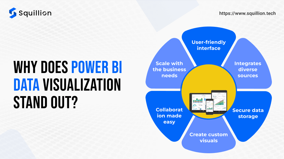
Why does Power BI data visualization stand out?
Power BI (Business Intelligence) is a data visualization platform that helps businesses and individuals understand data better. The platform is designed for technical and non-tech folks to make data analysis accessible and manageable. According to a study, Power BI will be the most preferred business intelligence tool 2024. The following are a few reasons why businesses across the globe trust Power BI for data visualization.
User-friendly interface
When we hear data visualization, most imagine pulling up multiple screens and typing codes. However, data visualization in Power BI is as easy as choosing a sheet and clicking the visual of your choice. Power BI simplifies data sheets such that it helps you create a dashboard with visuals that help you represent your data better without any hassle.
Integrates diverse sources
Once upon a time, data analysis included a lengthy process of switching through various data sources, streamlining them, and using visualization tools for final editing. However, Microsoft Power BI Consulting Service helps you ditch the hassle by integrating diverse data sources in one place. Therefore, cleaning and extracting data becomes more straightforward and more manageable. Power BI can integrate data sources like Excel, SQL databases, Google Analytics, and even cloud services like Azure. It helps you create a centric database for consistency and reliable data analysis across your departments.
Secure data storage
Data security is among Microsoft’s top priorities. Therefore, Power BI also offers a robust data security setup to ensure your sensitive business data is secured and accessible to those you approve. They provide role-based access, data encryption, and data labels to help you better secure your data.
Create custom visuals
Data visualization in Power BI is easier with the existing visuals offered by Microsoft Power BI. However, each business has unique data and analysis needs. Therefore, Power BI provides services to custom visual developers to create custom visuals from scratch. Thus, you can develop custom dashboard visuals to understand your data better.
Collaboration made easy
Teamwork is essential for your dream to work. Therefore, data visualization in Power BI is suitable for cross-department work through collaboration. You can assign Power BI roles to your team members in the workspace to create dashboards and access data as needed. However, the roles can be assigned based on their Power BI account. However, a free Power BI licence will work if the member needs to read or view-only access.
Scale with the business needs
Power BI data visualization caters to businesses and projects of all sizes. You’ll need a Microsoft account and Power BI licence to access and create workspace for your business. However, you can start with a licence that fits your budget and business needs. As you grow, you can switch to a higher licence for more services in Power BI. Thus, data visualization in Power BI is scalable to meet your needs.
How do you use data viusalization in Power BI?
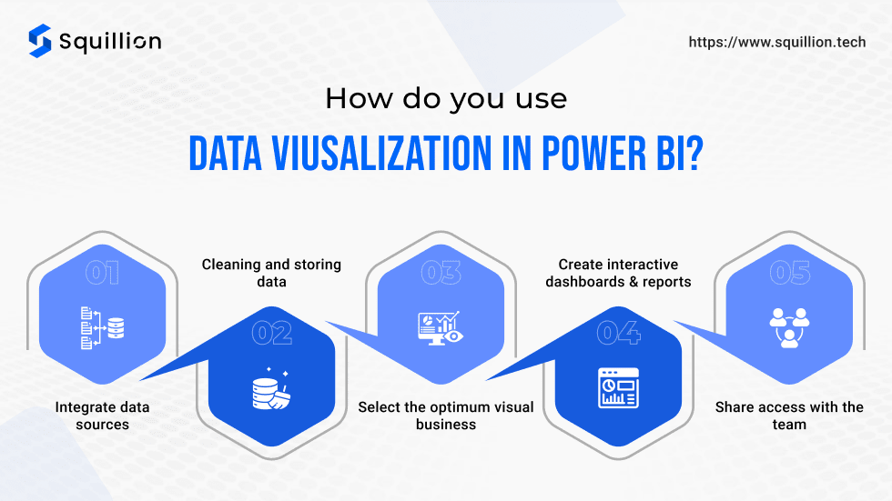
Data visualization in Power BI is smooth and effortless if you know the right clicks. Following is the basic flow of Power BI data visualization:
Integrate data sources
The critical component of Power BI is the live data sets for live and interactive dashboards. For this, they provide an integration service. Thus, you can connect all your data sources (excel, another database, and cloud database) in Power BI. Therefore, you can import the data as needed to create suitable models. You can use these models for practical data analysis and visualization without errors.
Cleaning and storing data
Integrating data sources is not the end of the job; it’s the beginning. One of the most time-consuming yet critical steps of data visualization and analysis is to clean the data sets. It helps you store the data efficiently to facilitate the users in future. Power BI provides you with tools to eliminate duplicate and empty data cells. Furthermore, they enable the Power BI developers to create data models for a data set specific to data visualization needs. It is similar to grouping specific data to extract them when needed quickly.
Select the optimum visual
Visuals are charts, graphs, and other alternatives to represent your data in a visually appealing manner. However, each Power BI visual is designed for a particular data type. You can choose the one that fits your data model and KPIs. However, it is normal not to find an existing visual to create a dashboard for your KPI. In such cases, Power BI custom visuals come in handy. The Microsoft-certified custom visual developers for Power BI can help you create the best visuals from scratch, tailor-made to your needs.
Create interactive dashboards and reports
The users prefer data visualization in Power BI because of its interactive dashboards. The Power BI visuals contain filters to alter the data sets in a model for more insights. It allows users to understand the data set from different perspectives and gain more insights. It is helpful for upper management to analyze the data according to their needs before making any strategies or business decisions.
Share access with the team
Power BI enables the team to share the dashboards and reports via a role-based access system. In our previous blog, we talked in detail about the roles in Power BI and how you can choose the best role for your team for data visualization in Power BI. By sharing access to the dashboard, you can maintain clear communication, data consistency, and avoid any errors due to data mismanagement. Power BI services like Power BI embedded make it easier to show you insights, like your global market reach, to your target audience through the website.
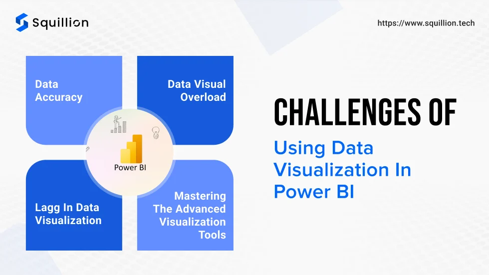
Challenges of using data visualization in Power BI
Power BI has its own set of challenges for business. However, with some help from Power BI consultants, you can overcome them and get the best ROI and valuable insights for your business. Following are the few most common challenges of using Power BI for data visualization.
Data accuracy
Data is the life of Power BI. However, double-check the data consistency in the database and the source. Frequently, due to any error, any data accuracy can happen, leading to inaccurate data visualization. These visualizations influence the decision. Therefore, data accuracy needs to be maintained.
Data visual overload
Too much of anything is harmful. Dashboard for data visualization in Power BI is no different. Adding multiple visuals to a dashboard may seem tempting, but it impacts the clarity of the dashboard. The viewer may get overwhelmed by the visuals and find it more confusing than helpful (as intended). Therefore, shortlist your KPIs and create relevant data models. After this, you can create basic dashboards with filters to facilitate users’ data analysis in advance.
Mastering the advanced visualization tools
Power BI is one of the best tools for non-tech users to analyze data for visualization. However, at some point, you’ll need advanced tools and methods to understand your data. Therefore, understanding advanced Power BI features like DAX (Data Analysis Expressions) and custom visuals may require training and practice. Investing in skill-building can help users maximise Power BI’s capabilities. You can save money and time while getting the best results by opting for the Power BI consulting service. The Power BI consultant helps you understand your data and create a database and dashboard to track your KPI.
Lagg in data visualization
Power BI performance may be affected by complex dashboards and datasets. It is harmful to the account and wastes potential. Therefore, optimize performance by reducing the number of visuals per page, using data aggregations, and limiting real-time updates unless necessary.
With the help of a skilled and Microsoft-approved partner for Power BI can help you overcome these challenges easily. If you want to embrace Power BI to understand your data better and identify trends and threats, you are in the right place! Squillion Tech can help.
Squillion Tech: Your partner for Power BI custom visuals
We are Squillion Tech, a Microsoft Partner offering Power BI Consulting Service. We offer diverse Power BI services like consultation, custom visual development, and hiring Microsoft-certified developers per your project needs. We have worked with diverse industries to harness our skills for data visualization in Power BI.
We let our work do the talk for us. Therefore, we are proud to say that our custom visual ‘Map By Squillion‘ has reached the top 50 custom visuals within 6 months of its launch. We can create a custom visual based on your needs without hassle.
Following are a few things that you can expect if you work with Squillion Tech:
Custom visual expertise: Our team of certified Power BI custom visual developers create a development plan to ensure your project sails smoothly.
Industry experience: We have worked with diverse industries, offering our services to help them streamline their data analysis and visualization.
Robust security: As a Microsoft Power BI partner, data security is our priority. Therefore, we provide role-based access and encryption to ensure data safety. We optimize the security as per the industry standards for the best results.
Consistent support: We understand that operating Power BI is tricky. Therefore, our team helps you at each step with regular follow-ups, performance reports, and more.
We can help you understand your data better and boost your growth. Contact Us to know more!
Conclusion
Understanding your data is crucial, irrespective of your business size. However, data analysis can be daunting. Therefore, data visualization in Power BI is one of the easier ways to help you understand the tale of your data. Power BI offers a user-friendly interface that integrates data sources, creates visuals, and shares workspaces with your team. The dashboard helps you make a story your data tells with interactive visuals. While Power BI offers many visuals, your KPIs might need something extra. That’s where Power BI custom visual helps you. They are made from scratch to fit your needs. You can contact a skilled Microsoft Power BI-certified custom visual developer like Squillion Tech. Squillion Tech helps you overcome many challenges like data inaccuracy, data visual overload, lagging, and using advanced visuals to understand your data better.

