Imagine going to a toy store as a kid and getting bombarded with many choices. It would have you excited and overwhelmed. The chances of choosing a toy you might not like later are high. Working with Power BI data visualization is similar. Instead of toys, you must choose from diverse visuals (charts) to understand your complex data and make decisions. So, here we are with a simplistic guide to help you understand the Power BI visuals and how to choose a visual to understand your data.
Importance of choosing Power BI data visualization chart
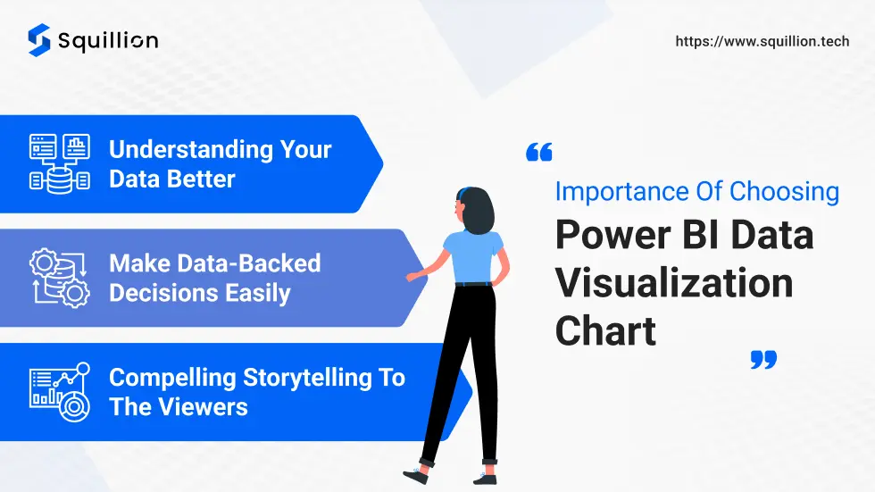
Data-backed decisions are more likely to succeed. However, data analysis and understanding the analysis results can be difficult for non-tech background people. That’s where Power BI data visualization becomes important for any business! Using Power BI data visualization, you can analyze trends, forecast growth, and pinpoint areas for improvement. There are a few more benefits of data visualization in Power BI, let’s take a look.
Understanding your data better
Data is the gold mine of any business. It helps you understand a business’s past, track its present, and project future trends. However, data sheets filled with complex numbers can be more rigid to understand. Statistical data could be a little tricky to understand, especially for those unfamiliar with the concepts. Additionally, understanding statistical data takes time, which the board and upper management always lack. With Power BI data visualization, you can create a visual board and share it with whoever may be concerned to understand the business operations at a glance.
Make data-backed decisions easily
If you were offered a chance to pick a raw material supplier after proper market research or choosing them blindly, which would you like? A sane choice would be doing thorough research and comparison before choosing a supplier because it decides the future of your business. Similarly, understanding your data is vital to make strategic decisions. It helps you quickly understand your market, current performance, customer behaviour, competition, and other KPIs.
Compelling storytelling to the viewers
Compared to a page-long paragraph, an animated video is more understandable. Similarly, rather than plain data sheets and charts, the Power BI data visuals effectively convert plain data into a compelling story understood by all. The Power BI data visualization charts help you create a visual dashboard with interactive visuals for the viewer to analyze the data from diverse perspectives.
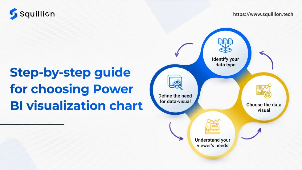
Step-by-step guide for choosing Power BI visualization chart
Power BI has many alternatives to visualize your data on the dashboard. However, not every chart or visual is suitable for your data. For example, you can show time-based growth with a pie chart. It is impossible to understand the changes over time, leading to difficulty in decision-making. Therefore, choosing the correct power BI visualization chart is vital. So, we present the following step-by-step guide to help you choose the right fit.
Identify your data type
Power BI data visualization relies on your data. Therefore, clearly understanding your data is vital for efficient analysis and visualization. Each data set can be understood based on the following types:
- Categorical data: This type of data can be divided into categories. For example, the demography of your customers, products, department-wise data, and more.
- Time-series data: This type of data shows the performance or data trends over a span of time: weeks, months, or years. For example, the KPIs include sales, target met, revenue earned, investments, customer behavior, and more.
- Correlation data: In business, the most important data type is correlation. They indicate the relationship between two or more variables. For example, the demographics of the customer and the demand in their area.
- Part-to-whole data: We examine the components contributing to the significant impact. For example, regional sales contribute to the overall sales of the business.
Each of these data types needs specialized charts for Power BI data visualizaiton. Therefore, understanding your data is the first step for effective data visualization. You must clean and update your data set to understand the data type clearly. It helps you create dashboards efficiently without any errors.
Define the need for data-visual
Imagine you have to attend a wedding but don’t have anything to wear this time. So, you decide to go shopping. When you enter the mall or the street where you shop frequently, you will see various shops selling apparel. However, you’ll look for those with a collection for festive or party events. That’s what happens when you define the purpose.
In Power BI data visualization, you must define your purpose before diving deep into data visuals. It helps you narrow down the options and choose the best fit. You can pick the visual based on your data type and dashboard design.
Understand your viewer’s needs
The members of the organizations use data dashboards for various reasons. Therefore, Power BI allows you to create separate workspaces to cater to everybody’s needs. It includes the higher executives, department heads, managers, and team members. Each of them has various levels of knowledge and needs for Power BI data visualization. For example, the CEO most likely needs summarized data visuals, while the managers need detailed insights to enhance performance and make better team decisions.
Choose the data visual
There are a few visuals to help you create an effective dashboard based on your purpose and data type. Each of the data visuals has unique characteristics that allow them to express the story of the data efficiently. Let’s understand more about the standard and frequently used Power BI data visualization charts.
Bar chart:
An alternative to a bar chart is a column chart used to represent the categorical data best. Here, the bars or columns are used to compare the performance of single or two categories of data on set metrics. For example, sales of one or more departments or comparing product categories’ performance.
Line chart:
The line chart is the best fit for time-series or correlation data to highlight the highs and lows of the KPI. It is perfect for the decision-making process and tracking the performance over time. The line chart can show the decision’s impact on the KPI in a single glance. For example, you can track the website traffic over time and its highs and lows with marketing campaigns.
Pie chart:
A pie chart or donut chart shows percentages or part-to-whole data effortlessly. It is one of the classic data visuals used to show the distribution of the KPI components. For example, you can use the pie chart to track the market share of the competitors, the contribution of each product category in overall sales, and more such data. It can help you understand the details of any categorical data.
Table chart:
Data visuals are used to make data analysis easier. However, there are times when the viewers need specific numbers in the dashboard. That’s when table charts are used. These charts could present summarized data, such as quarterly or yearly sales and other datasets.
Area chart:
Area charts are used to understand the changing trends in large volumes for multiple categories. It helps you overlap the data trends and identify any relationships and KPI performances over a long period. The pro-tip is to overlap only a few (two or three) data sets for clear understanding.
Scattered chart:
The scattered chart is used to understand the relationship between two or more data sets. It helps users identify the relationship between the data sets and draw trends from the numeric data. It helps in making result-oriented decisions. For example, it suits correlation data types like marketing efforts and customer acquisition.
Map charts:
When you expand your business, you need to track various KPIs in diverse locations. That’s where Power BI visualization can come in handy. The Map allows you to pinpoint a KPI performance in multiple places. It is perfect for distribution-type data like the sales and revenue generated in your targetted locations. The map charts can help you identify demand trends to divert your marketing and production strategies.
A Power BI consulting firm can help you through this process. So, if you want to find a reliable consultant, check out our blog on Power BI consulting company.
What is the need for Power BI custom visuals?
It is common to find these existing visuals unsuitable for your data sets. Therefore, Power BI offers a custom visual development service to help users create custom Power BI data visualization charts to fit their needs. Following are a few reasons why custom visuals are beneficial for your business:
Visuals catering to your needs
With custom visuals, you can create a data visualizaiton chart catered to your data set. It helps you understand and analyze your data better.
Industry-specific designs
The generic visuals might not be able to visualize industry-specific KPIs like project development or cost contribution. Custom visuals can eliminate the hassle and make the data analysis process more manageable.
Boost interactivity and understanding of visual
Custom visuals can provide a more interactive experience, allowing users to drill down or filter data uniquely.
Branding of visuals for embedding
Often, businesses want to share a live KPI with their target audience, like the country’s presence and total customers. In such cases, custom visuals provide a white-label data visual for embedding in the app or website.
So, now you know how to pick a Power BI data visualization chart and the benefits of building a custom visual. But how do you create a custom visual? That’s where we can help you!
Squillion Tech: Your Power BI Partner For Growth!
Squillion Tech provides Power BI Consulting Service, including custom visual development. Our Microsoft-certified Power BI developers create custom visuals befitting your business goals and KPIs. Thus, Power BI custom visual developers work closely with you and your team to ensure the visual is perfect for your needs. Our certified custom visual developers have created ‘Map Of Squilion,’ our custom visual ranking in the top 50 visuals of Power BI within 6 months of launch. So, believe us, we can help your business grow with Power BI!
You can expect the following from Squillion Tech ss Microsoft Power BI partners:
- Custom strategies for Power BI dashboard and chart selection
- Custom data visual development
- Integrating various data sources efficiently
- Cleaning and creating applicable data models
- Data protection by establishing multiple data security protocols
- Consistent support and team training
- Regular updates based on industry standards
Contact us now for more information!
Conclusion
Power BI data visualization is essential for businesses to understand their data. It helps them identify trends and weak areas and optimize their operations. However, choosing a data visual chart is essential to easily represent the results of data analysis. Based on the data type, the purpose of data analysis, and your viewer’s needs, you can choose an optimal data visual. We discussed the classic charts like bar, pie, area, map, scatter, etc. However, if you don’t find a suitable chart, you can DIY it through Power BI custom visual. It helps you create a visual from scratch based on your needs to help you present your data better. Custom visual developers like Squillion Tech can help you build the visual per your needs. Explore our Power BI services for more information!

